Top Web Design Trends Your Customers Need You to Have in 2016

We used to think design trends were just aesthetically pleasing. It’s nice to have them but it’s cool if you don’t. You’ll still get by.
That’s no longer the case. While there are still many trends that are solely for viewing purposes, quite a few of the ones we’ve seen in the past couple years have no become mandatory staples of websites.
Not only are your customers actively looking for these when they visit you online, some have even become so important that they can literally hurt your chances of being found if you don’t have them.
So let’s take a look at the top design trends that you’ll need to have in 2016 to stay in the game.
Responsiveness
We’ve been talking about making your site responsive for a few years now, it has gone past trend status and become a mandatory requirement for pretty much every business with a website.
Your customers are moving more and more towards mobile devices, such as phones and tablets, as well as smaller computer screens. Therefore, you need to ensure that they are getting the best viewing experience possible on each of those devices when they visit your site.
You might be thinking that this is not a good enough reason to make this a priority, well how about this? If your site isn’t responsiveness when people are searching online for your services, Google will penalize you and lower your search ranking. And since studies have shown that 51% of mobile local searches result in a store visit, you might want to rethink those priorities.
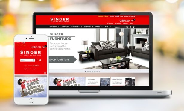
For this reason, when we redesigned SINGER’s website earlier this year, we gave a website that works just as beautifully on mobile as it does on the web.

Large, Bold Fonts
As we mentioned above, Google has started penalizing sites that are not mobile-friendly. Responsiveness is only one factor of mobile-friendliness, and fonts are another. When viewing from a mobile screen, fonts that might seem average on a computer might be rendered quite tiny on a phone. Experts recommend that the font of your paragraph texts are at least size 16.
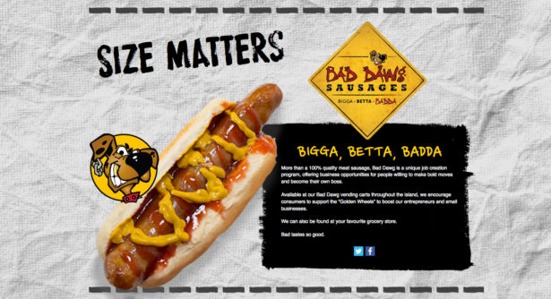
Along with using large fonts for paragraphs, it’s now perfectly acceptable (and welcomed, even) to use large, bold headings in place of multiple graphics. Your heading is a place to communicate immediately with your audience, so don’t waste on some fancy, complex design elements when you can share your message with your visitors quickly and succinctly.

Casual, Friendly Copy
Out with the boring, corporate-speak and in with the easy-to-read friendly language that makes your reader feel like part of the family. No one wants to read about your paradigm shift and your innovative collaborative visionaries or how you “think outside the box”. In fact, if they fall on this list and appear anywhere on your site, considering nixing them right away.
That’s not to say you should descend into madness and tlk lik a tnager on Twtr. Unless you’re appealing to teenagers then that might actually work in your favor. What we’re saying though, is focus on sharing your message in the clearest form, opt for transparency and straightforwardness instead of replicating a PhD dissertation.
Want some inspiration? Check this out.
High Quality Visuals (Small in Size)
If you’re still using Flash graphics on your website in 2015, don’t carry it over into the next year. It’s hurting way more than it helps. Here’s why.
Flash is heavy and completely unnecessary. Websites with Flash graphics take so long to load that many people simply close the page, never getting to experience your content. And that’s not the worst part. It might take long to load on computers, but it won’t load on mobile devices at all. They don’t support it. So that pretty rotating display you have on your homescreen, yeah, no one’s seeing that. Let it go.
What to do instead? Well you have multiple options. 2015 could have been declared the year of visuals because we had so many of these trends peaking. From large, stock photos and videos available absolutely free in multiple places, you won’t need to spend US$100 or more each year on stock photography. The key is to use these reduce the size of these great quality images before uploading to your site so they take up less space.
GIFs have also made a huge comeback. Back in the nineties, GIFs were tiny, grainy, poor quality looping graphics that we all thought were cool back then but quickly outgrew. You remember the dancing baby, right? Well, modern day GIFs have received a much-needed upgrade and with many social media sites allowing their uploads, they have even become a form of communication. Because some reactions can only be fully understood through Captain Sparrow.
(Hint: to make your page load smoother, embed GIFs directly from giphy.com like we did, instead of uploading them to your site.)
Social Integration
We made sure to tack this one on because it’s one of the simplest things to include on a website but it’s shocking to see how many businesses do it wrong.
If a customer is browsing through your website and wants to get the latest info on promotions or even better, share a testimonial, chances are they will click on your social media links and leave you a message there. But way too often, these links either can’t be found, or don’t actually work.
Additionally, each page on your website should have social sharing buttons so persons who like your content can share it with their friends and colleagues and bring you even more wonderful people.
Sidenote: Our share buttons are below 🙂
There are quite a few other website trends we could get into, but we kept this list simple and practical. So if your website desperately needs a fresh coat of paint for 2016, these are the areas you need to be looking at first. Wish you all the best in 2016!
 We used to think design trends were just aesthetically pleasing. It’s nice to have them but it’s cool if you don’t. You’ll still get by.
That’s no longer the case. While there are still many trends that are solely for viewing purposes, quite a few of the ones we’ve seen in the past couple years have no become mandatory staples of websites.
Not only are your customers actively looking for these when they visit you online, some have even become so important that they can literally hurt your chances of being found if you don’t have them.
So let’s take a look at the top design trends that you’ll need to have in 2016 to stay in the game.


